ROLE
UI/UX Designer
CLIENT:
VELVET GALLERY
PLATFORM:
iOS
YEAR:
2025

Art to Action
From fragmented discovery to a calm, accessible, one-step booking flow.
about.
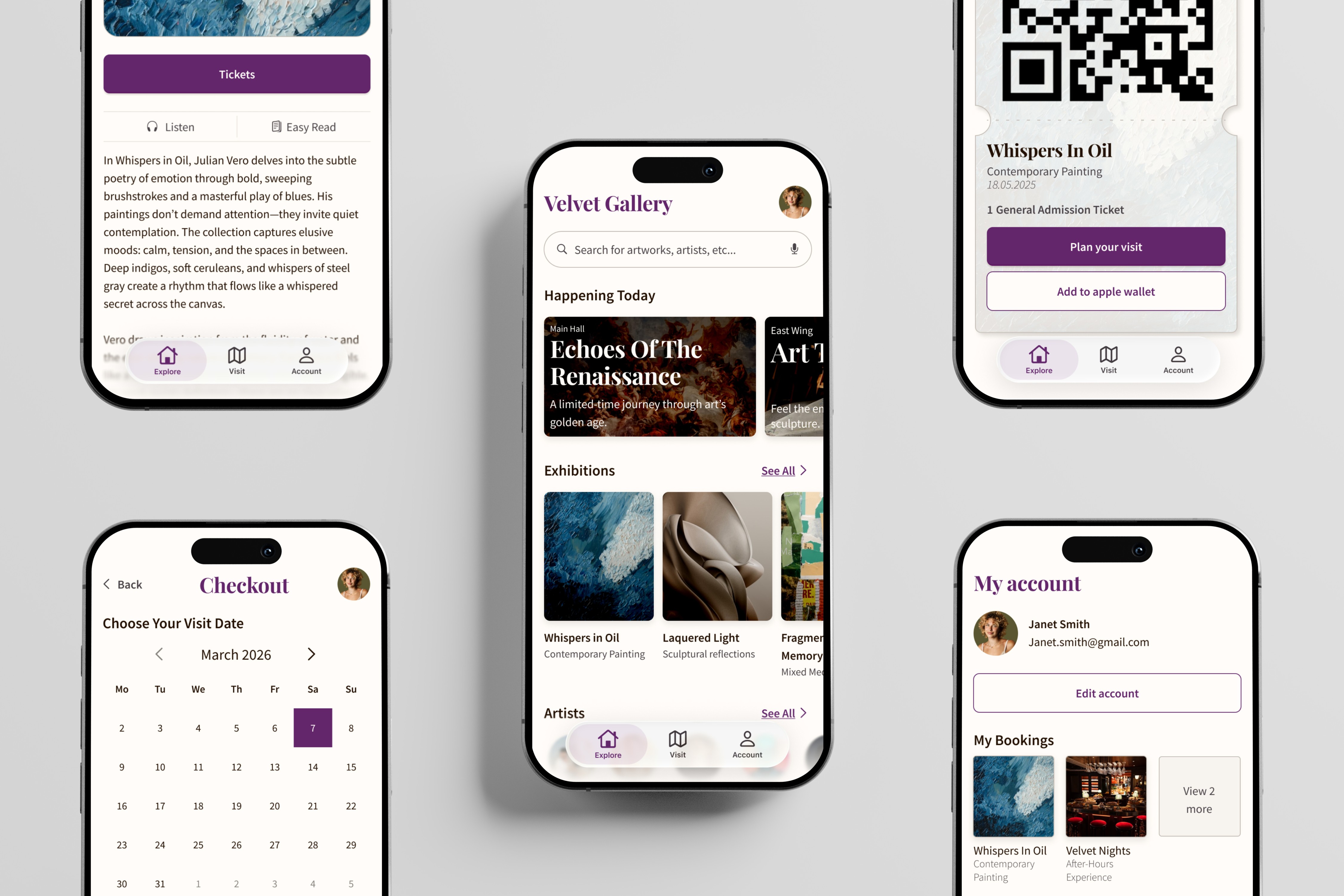
Velvet Gallery is an iOS app that centralises exhibition discovery and ticket booking for museum visitors, replacing a fragmented, multi-platform experience with a single calm, accessible flow. I owned the project end-to-end: research, IA, interaction design, design system, and two rounds of testing, and made one deliberate call early: cut ten features to fix one journey properly. The interface serves neurodivergent users, older adults, and casual visitors without treating accessibility as a separate track. All five test participants completed the booking flow without assistance nor hesitation.
01 – Problem
The pre-visit experience was broken
For many museum visitors, the magic ends the moment they go online. Exhibition details live across multiple platforms, a gallery's website, Instagram, third-party ticketing apps, with no single source of truth. Booking flows are often confusing. Interfaces are dense and visually overwhelming, particularly for older adults and neurodivergent users.
The result: friction before the art. People either give up, arrive under-prepared, or simply don't visit at all.
02 – Research
Narrowing scope through evidence, not assumption
The earliest challenge wasn't design, it was focus. Museum apps can go in many directions: audio guides, social features, membership management, event discovery, in-gallery navigation. Before designing anything, I needed to understand which problems were actually worth solving.
I spoke with five people across four groups: art enthusiasts, busy professionals, older adults, and neurodivergent visitors. Their circumstances were different, but their frustrations weren't. The same three frustrations surfaced in every conversation:
Scattered information
Users pieced together exhibition details from multiple platforms (websites, social media, third-party apps) with no reliable single source.
Confusing booking
Existing booking flows involved too many steps, unclear feedback, and abrupt redirects to external payment systems.
Visual overload
Many museum interfaces prioritize information density at the cost of readability; particularly problematic for neurodivergent and older users.
Running a competitive audit added another layer of insight, it helped me understand the existing landscape, i.e. how institutions of different sizes organize content, handle booking, approach accessibility, and make trade-offs between breadth and focus. A pattern emerged: larger institutions offer depth and functionality but can become difficult to navigate; smaller galleries tend toward more curated, intimate experiences but often at the cost of capability.
That contrast pointed to an opportunity. There was space for a product that combined the functional depth users expect from a larger institution with the clarity and sense of curation that smaller galleries do well, all without the information overload that tends to come with the former.
This research produced a clear brief: simplify discovery, streamline booking, and design a calm interface that accommodates diverse needs.
03 - Design Process
Turning research into structure
Sketch -> Lo-fi -> Test -> Iterate -> Hi-fi -> Validate
The goal at this stage was to test the core structure before committing to visual decisions. Starting with paper sketches and then moving into low-fidelity wireframes meant I could put real interactions in front of users quickly, without the overhead of a polished interface making it harder to see what was actually breaking.
Across both testing rounds I used a deliberate mix of moderated and unmoderated sessions. Moderated testing let me observe hesitation in real time, aka. the pauses, the assumptions, the moments where users questioned themselves rather than the interface, and allowed me to ask follow up questions based on my obseravtions. Unmoderated testing showed how people navigated when no one was watching, giving me a cleaner read on independent task behavior. Together they provided both the context to understand why something wasn't working and the behavioral signal to confirm whether the fix held.
Design direction
Paper sketches let me map the three core flows before any wireframing decisions locked them in: how users would browse and discover content, how the booking process would work from start to finish, and how account management and editing would be handled.
From there I moved into low-fidelity wireframes. The initial hypothesis was straightforward: a filter-led discovery experience, a linear checkout flow, and icon-based controls for editing account details.
Testing Round 01 told me which parts of that hypothesis needed to change.


Testing Round 01
What the low-fidelity prototype exposed
Discovery. The initial design asked users to make too many filter decisions before they could simply browse. The filter bar was heavy and the results sat too far from the controls that shaped them. I reduced the primary filters to four experience types, moved secondary options into a collapsible panel, brought search closer to where results appeared, and added a layout control so users could adjust how content was displayed. The change was about reducing the decision overhead at the point of entry. Browsing should feel like exploring, not configuring.
Checkout. Users who wanted to change their saved payment method found they had no way to do it without leaving the checkout flow entirely. That's the wrong exit to force during a booking. So I moved payment-method editing into the checkout flow itself, keeping it accessible at the moment it was needed. Personal-information changes stayed in Edit Account. Not everything needs to be reachable from everywhere, and that setting genuinely belongs outside of a purchase context. The distinction matters: a critical task flow shouldn't require users to abandon it for something that could be handled in place.
Account editing. The icon-only trigger for editing account details wasn't reading as interactive. Users passed over it or weren't sure what it did. I replaced it with a labeled Edit Account button and added a Save Changes state with explicit confirmation after a successful edit. The confirmation wasn't decoration, users who had made changes had no way of knowing whether anything had happened. Closing that feedback loop was the fix.
One pattern from the moderated sessions was worth noting separately: when users hesitated, they often assumed they had done something wrong rather than recognizing an interface problem. That's a useful diagnostic signal. It points to ambiguity in the design, i.e. places where the interface wasn't giving users enough to feel certain about what to do next.


Iterating toward high fidelity
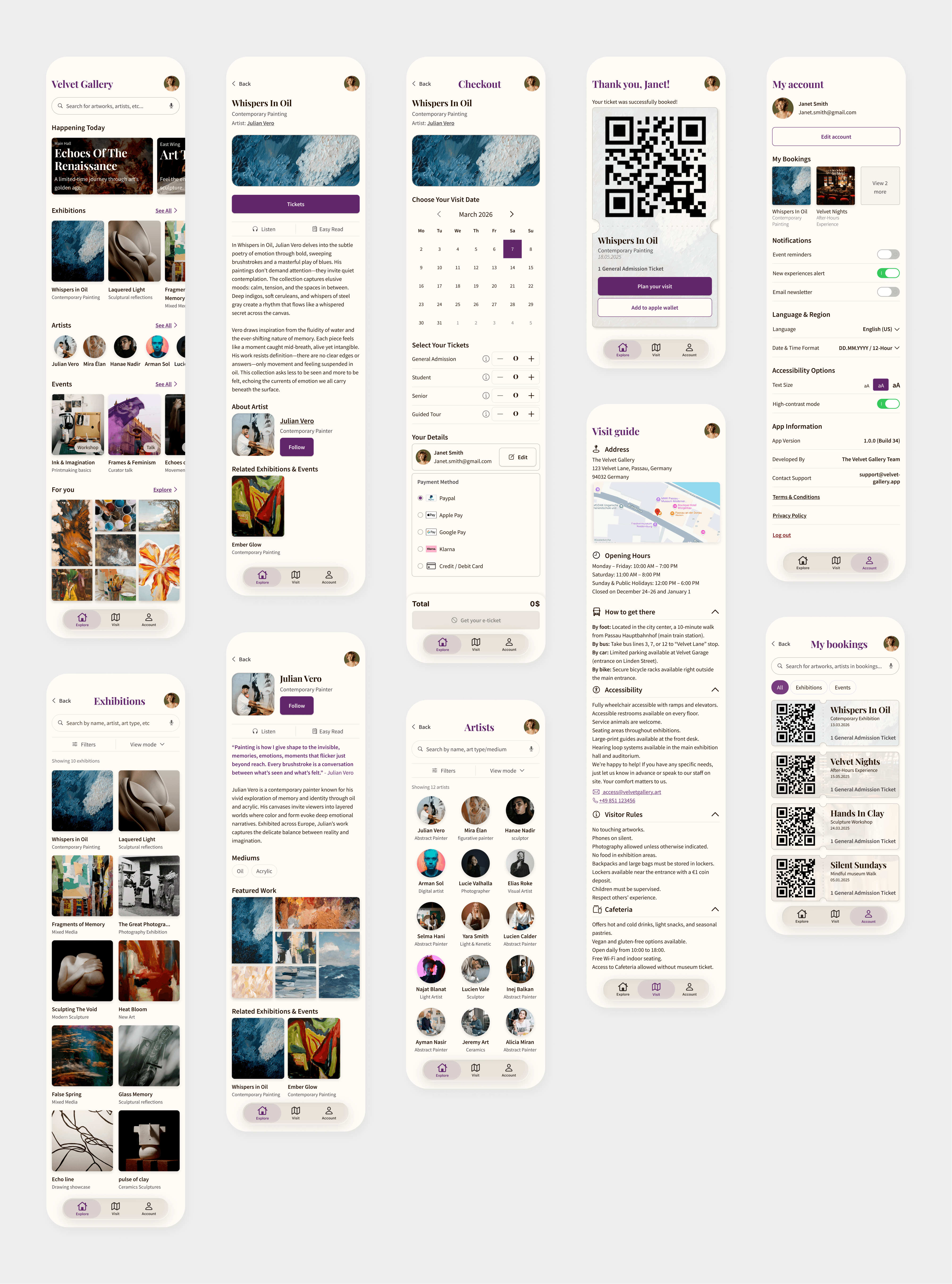
With the core interactions refined, I moved into high fidelity. Working with realistic content revealed one remaining structural issue: the home feed was difficult to scan. A flat scroll of everything at once obscured what was actually available. I reorganized the content into labeled rows — Happening Today, Exhibitions, Artists, Events, For You — with See All providing a path into each category. That structural decision made the content hierarchy legible before Round 02 began.
Testing Round 02
Validating the refined experience
Round 02 was run on the high-fidelity prototype. The structural questions had already been answered, this round was about confirming that the refined experience held up under more realistic conditions.
It did. Search stayed prominent and easy to locate. The category rows and See All links worked as secondary navigation without competing with the primary browsing path. Navigation felt intuitive, and users who made wrong turns recovered without frustration. The booking flow, from exhibition detail through to ticket confirmation, was fast and uninterrupted.
The clearest signal from this round was behavioral: the pattern of self-blame from Round 01 was gone. Users did not experience hesitation or confusion anymore, they rather moved through the experience with confidence. That shift was what the iteration had been working toward.
With the structure validated, the next stage was turning it into a coherent visual experience.
04 - Visual Design
Restraint as a design principle
The visual identity of Velvet Gallery was built around a single conviction: the interface should recede so the artwork can lead.
A restrained palette of deep purple and warm neutrals creates a quiet foundation for exhibition imagery and content. Contrast and hierarchy are used deliberately to guide attention, while generous space keeps the interface from competing with what visitors came to see.
The same restraint carries into the interaction design. Accessibility is built into the interface through reduced animation, clear states , options for text size, high-contrast mode and generous touch targets. Visitors can also choose how they browse and consume information, from Compact, Gallery, or List views to Audio and Easy Read exhibition descriptions.
The booking flow was designed to be operable with minimal cognitive load: each screen has one clear primary action and explicit confirmation, keeping the experience focused from selection to completion.
The result is an interface that feels considered without feeling heavy, giving users the structure they need while leaving space for the art itself.


05 – Results
From friction to confident completion
100% Task Completion
Every participant independently completed the full discovery-to-booking flow. Ratings improved from difficulty or non-completion in the first round to easy completion in the final round.
Faster task completion
Participants completed discovery and booking noticeably faster in the final prototype than in the low-fidelity round.
Familiar, focused navigation
Participants recognized the browsing patterns without guidance and found the limited number of categories comfortable to navigate.
06 - Reflection
Simplicity requires discipline
The hardest design decisions on this project weren't about what to add, they were about what not to. Every feature idea had a plausible justification. Research gave me permission to say no to most of them.
Two things I'd push further on a longer timeline: more granular accessibility testing with assistive technology users, and a defined success metric for the booking flow that could be tracked post-launch. Usability tests confirm intent; analytics confirm behavior.
Velvet Gallery is ultimately a product built on one conviction: the journey to art should feel as effortless as the experience of standing in front of it.