Users struggled to find up-to-date information and book visits quickly. Social media and
scattered platforms make planning frustrating and time-consuming, especially for users
with accessibility needs.
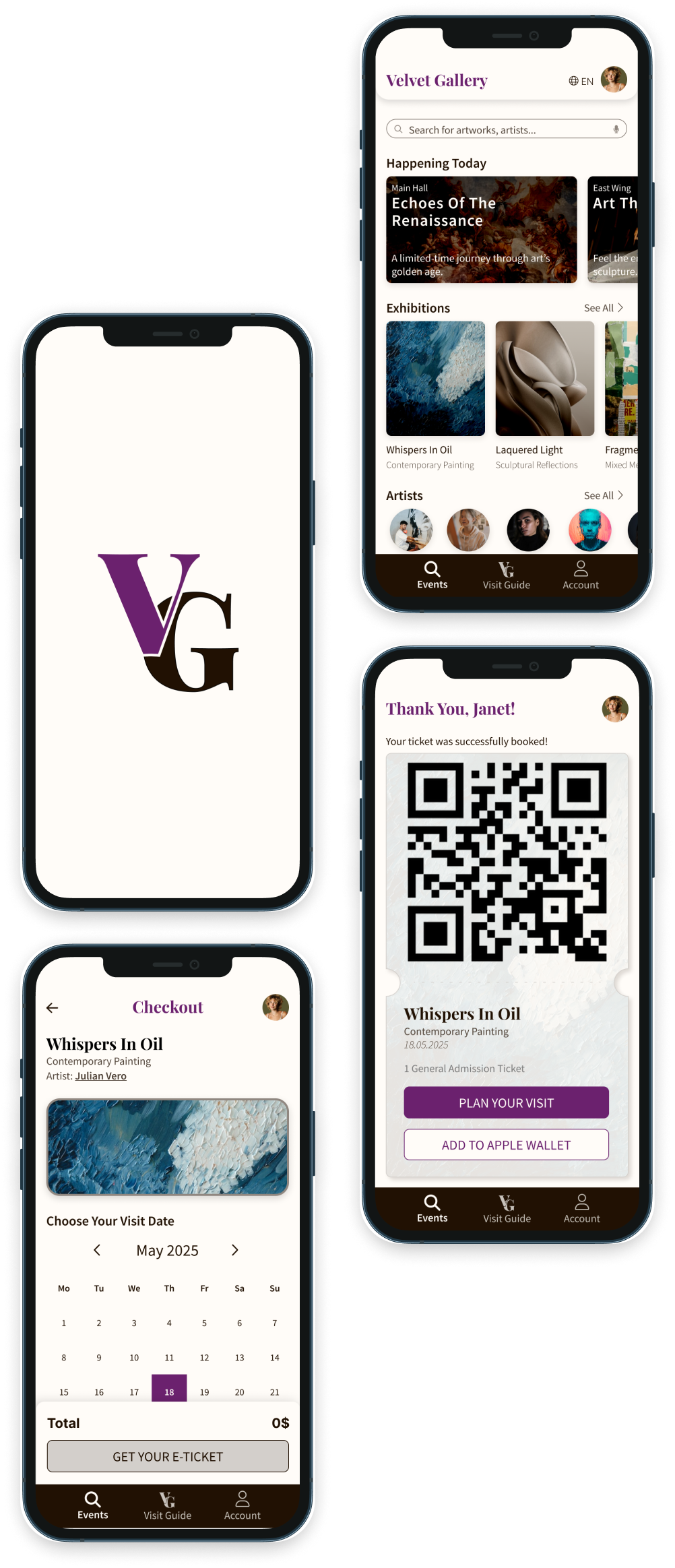
The Velvet Gallery app provides a centralized, accessible platform for discovering
exhibitions, events, and workshops, allowing users to quickly browse content and
schedule visits in a simple, one-click process while accommodating diverse needs and
preferences.
Role
UX/UI Designer
End-to-end Product Design
It all started with one question: how can the logistics of visiting a museum feel as
effortless as the wonder of the experience itself?
Museums can be magical spaces, yet the digital journey before the visit often feels
scattered or overwhelming. In the attention economy we live in, I wanted to design an app
that respects users’ time: an easy-to-browse home feed, quick search, saved personal
information, a streamlined booking flow, and a calm interface where the artwork can breathe.
Early on, I realized the biggest challenge would be scope. The project had great potential
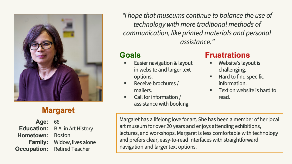
and many possible directions. Interviews with museum visitors helped me narrow the scope and
prioritize real pain points instead of designing for every possibility.
I spoke with art enthusiasts, busy professionals, older adults, and neurodivergent users.
Many described similar frustrations:
exhibition information scattered across platforms,
confusing booking flows, and visually overwhelming digital experiences.
Running a competitive audit added another layer of insight. Studying museum websites and
apps revealed how cultural institutions shape their tone online. Large museums often
prioritize scale and information density, while smaller institutions create more intimate
digital experiences. Analyzing booking flows also exposed usability issues I wanted to
avoid.
These insights clarified the direction of the project:
simplify discovery, streamline booking, and
create a calm accessible interface.
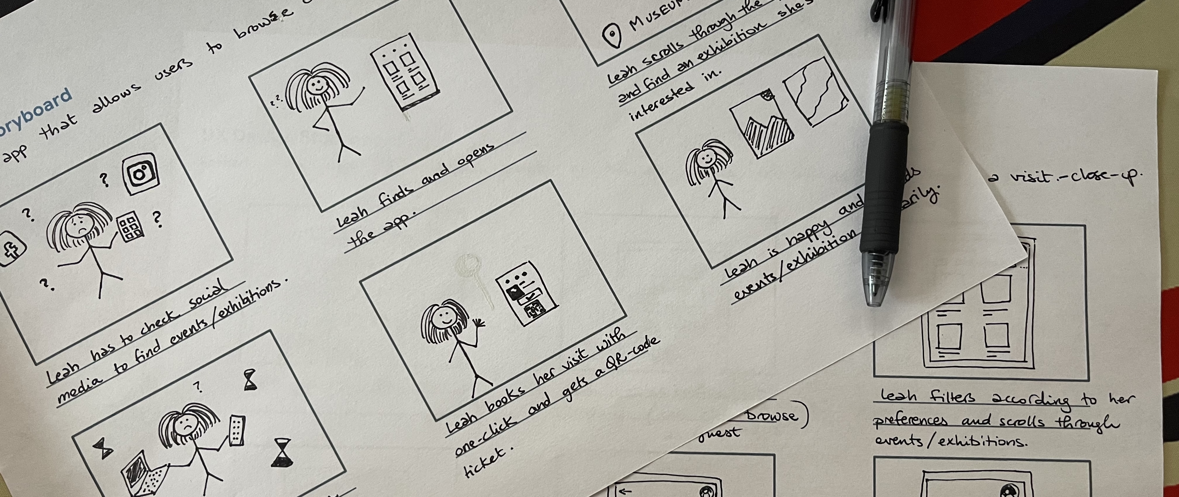
Once the core user journey came into focus, I began exploring ideas through paper sketches
before moving into digital wireframes to structure the main experience.
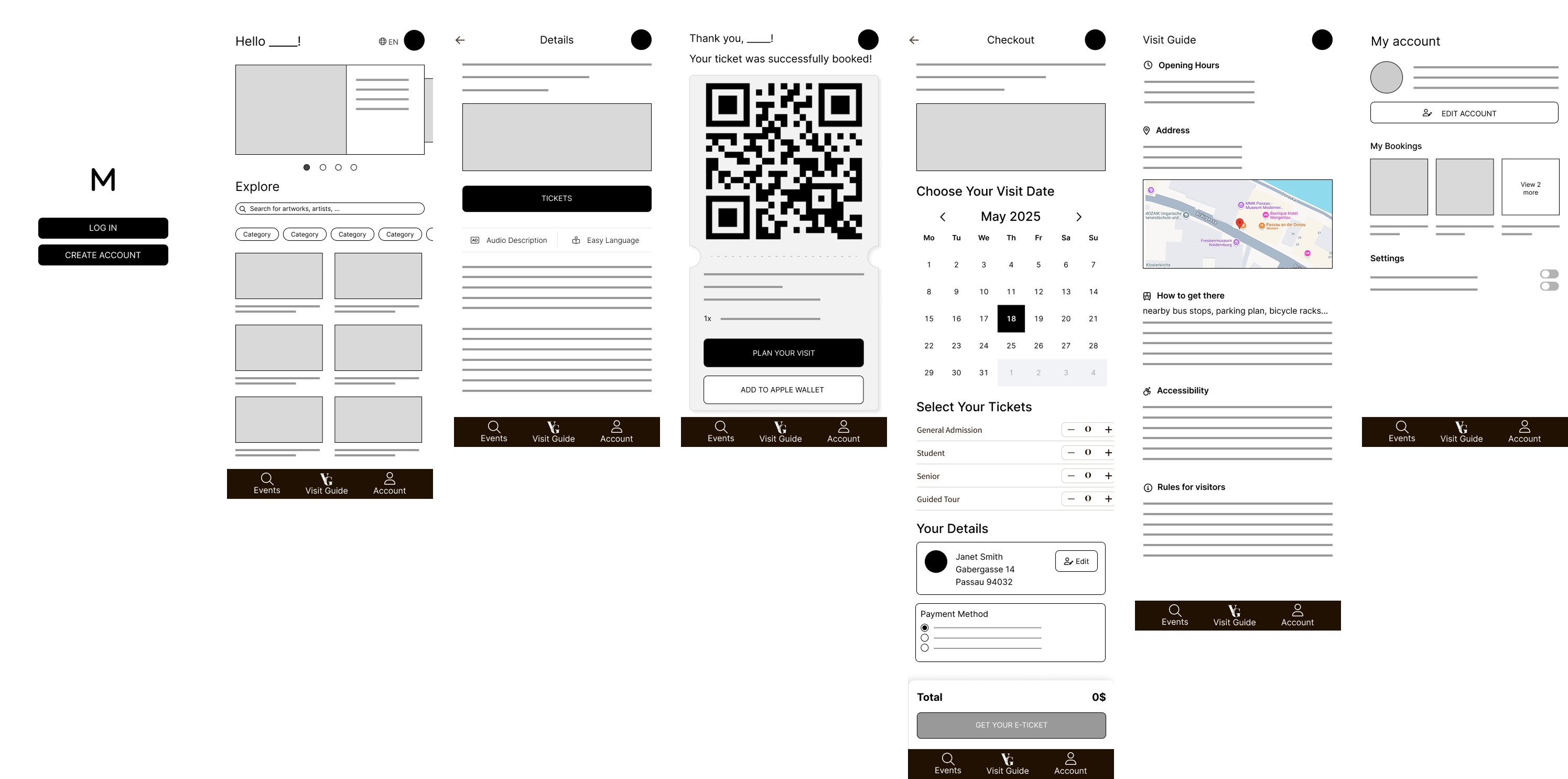
Early versions of the home feed relied heavily on filters and a long vertical list of
events. Testing the low-fidelity prototype showed that the flow worked, but browsing could
be improved. So I moved the search bar closer to the results and simplified the filters,
keeping four main experience types visible and shifting the detailed options to a
collapsible side panel.
Testing also revealed confusion around editing account details, so I replaced the icon-only
action with a labeled button and added clear save and confirmation feedback to reassure
users when changes are made.
During moderated sessions, I reassured participants that they weren’t being tested, the
design was. This created space for honest feedback, and one pattern stood out: when users
hesitated, they often assumed the mistake was theirs. That insight pushed me to refine the
design further to remove confusion and make planning a museum visit feel effortless.
With the structure refined, I moved to the design system and high-fidelity prototype.
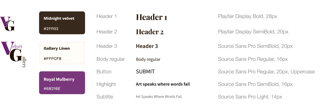
The visual identity of Velvet Gallery is intentionally restrained so the artwork remains the
star of the experience. Deep purple tones evoke creativity and cultural refinement, paired
with neutral colors for a calm, sophisticated interface.
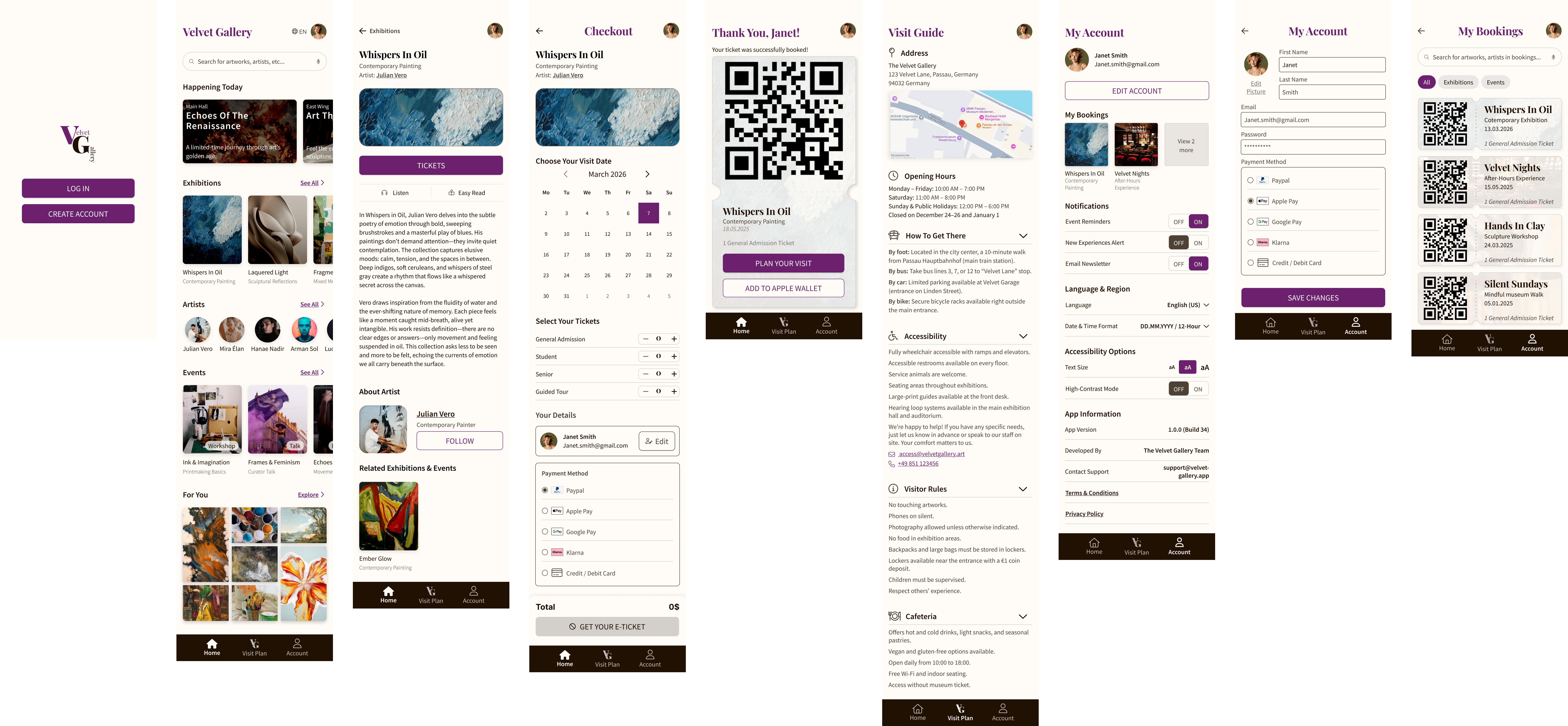
Once the high-fidelity prototype came together, another issue appeared: the browsing
experience felt visually crowded. To solve this, I reorganized the home feed into
categorized rows such as Happening Today, Exhibitions, Artists, Events, and For You. This
structure allows users to quickly scan what’s happening while still offering deeper
exploration through “See All” views.
In the final usability tests, all participants successfully completed the core tasks, from
discovering an exhibition to booking a ticket. The redesigned structure reduced the time it
took users to find an event and complete the booking process, and participants described the
experience as “smooth,” “professional,” and “easy to use.”
Working on Velvet Gallery reinforced something important: simplicity requires discipline.
The real challenge wasn’t adding features, but deciding what truly matters.
Velvet Gallery ultimately explores a simple idea: the journey to art should feel as
effortless as the experience of standing in front of it.